#前言
因为最近准备面试,同时也为了给自己扫除知识盲区,通过查阅相关资料来阐述一些不懂的知识点,同时结合自己的理解整理出一篇博客,以便温故。
#一些名词
- 静态布局
- 自适应布局
- 流式布局(百分比布局)
- 响应式布局(媒体查询)
- 弹性布局(rem/em、flex、grid布局)
- 圣杯布局
- 双飞翼布局
#静态布局
最传统的布局方式,网页中所有尺寸都是由 px 作为单位,设置了 min-width,如果宽度小于最小宽度就会出现滚动条,如果大于这个宽度则内容居中外加背景
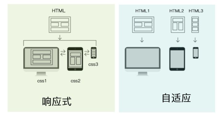
#自适应布局
多个html文件在不同分辨率屏幕显示来达到自适应布局
下面这张图很好的解释了自适应布局与响应式布局的区别
#流式布局
网页中主要划分区域的尺寸使用百分数,搭配(min-, max-)使用,分别为不同的屏幕设置布局格式,当屏幕大小改变时,会出现不同的布局。特点是布局改变,元素不变
#响应式布局
利用媒体查询可以检测到屏幕的尺寸,并设置不同的 CSS 样式,就可以实现响应式布局
@media screen and(max-width: 767px) {
  // ...
}
2
3
#栅格布局
现在许多框架都有自己的栅格布局,但是使用的尺寸大致相同,例如Element定义的尺寸:
- xs:
<768px, extra small - sm:
>=768px, small - md:
>=992, medium - lg:
>=1200, large - xl:
>=1920, extra large
#弹性布局
利用 rem/em 等方式布局
#五大布局结论
随着新技术的出现和时代的发展潮流,越来越多的网站舍弃了之前的不太灵活的静态布局,而是使用响应式布局,当然很多时候响应式布局会结合弹性布局一起使用,这样网站能够在所有设备上都能很好的展现出来。
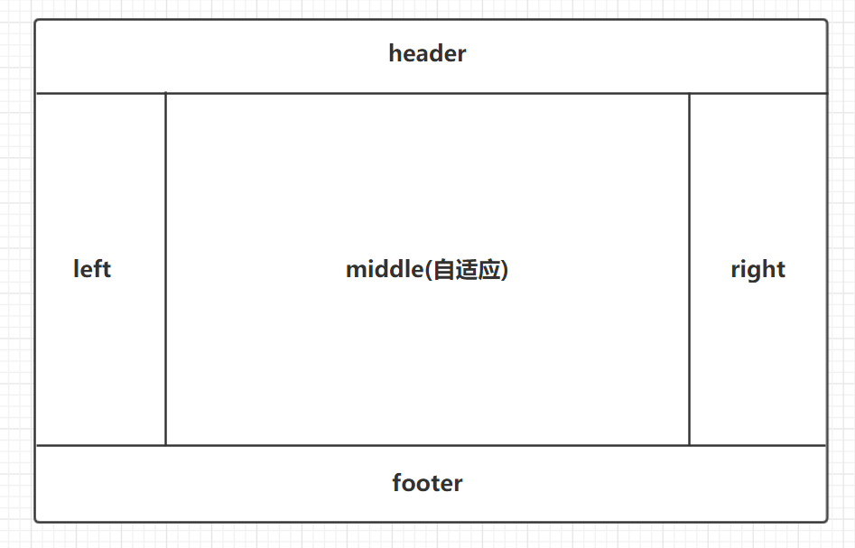
#圣杯布局和双飞翼布局
- 圣杯布局与双飞翼布局都属于三列布局的经典布局
- 它们的效果图一致,但是实现方法不同
#效果图
#三栏布局的代码示例
<header class="header"></header>
<main class="main clearfix">
  <div class="center">中间自适应</div>
  <div class="left"></div>
  <div class="right"></div>
</main>
<footer class="footer"></footer>
2
3
4
5
6
7
body {
  padding: 0;
  margin: 0;
}

.header,
.footer {
  height: 100px;
  background-color: purple;
}

// 清除浮动
.clearfix::after {
  content: "";
  display: block;
  clear: both;
}

.left,
.center,
.right {
  height: 500px;
  float: left;
}

.left {
  width: 200px;
  background-color: orange;
  margin-left: -100%; // center在left前面才会有这样的效果
}

.center {
  width: 100%;
  background-color: #eee;
}

.right {
  width: 300px;
  background-color: blueviolet;
  margin-left: -300px;
}
2
3
4
5
6
7
8
9
10
11
12
13
14
15
16
17
18
19
20
21
22
23
24
25
26
27
28
29
30
31
32
33
34
35
36
37
38
39
40
41
效果图:
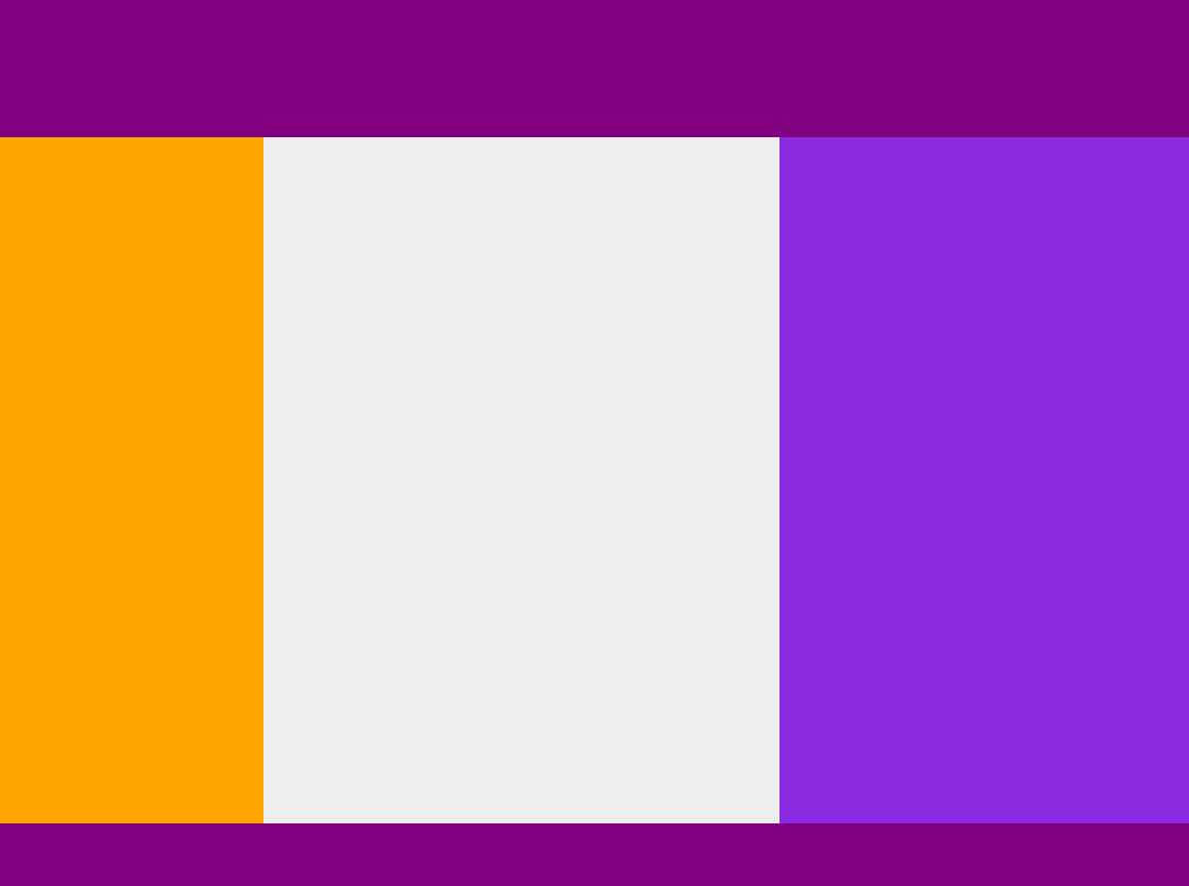
从效果图可以看出,中间的文字内容没有很好的显示出来,这是因为 left 和 right 两个元素是覆盖在 center 上的,而center的宽度是100%,因此造成了这样的效果,为了解决这一问题,圣杯布局和双飞翼布局使用了不同的方案来解决这一问题
#圣杯布局方案
给父元素添加一定的 margin,同时给 left 和 right 元素添加定位来使其在合适的位置
.main {
  margin-left: 200px;
  margin-right: 300px;
}

.left {
  position: relative;
  left: -200px;
}

.right {
  position: relative;
  right: -300px;
}
2
3
4
5
6
7
8
9
10
11
12
13
14
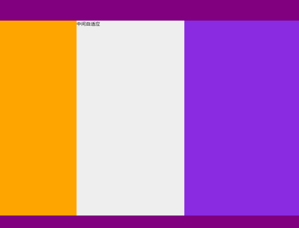
其实目的很简单,通过父元素的 margin 来增加 center 左右边距的距离,同时 left 和 right 元素根据定位补充 center 的空白,这样很好的实现了三栏布局
#双飞翼布局方案
通过给 center 增加子元素,然后子元素设置一定的外边距来解决上面三栏布局的问题
<div class="center">
  <div class="inner">
    中间自适应
  </div>
</div>
2
3
4
5
#最终效果
.inner {
	margin-left: 200px;
	margin-right: 300px;
}
2
3
4